In this essay I will be engaging in the record company, Rough Trade Records. I will also be analysing the switch from analogue to digital (digitalization) and the lasting effects of this change. I will also be talking about the growth of digitalization and how this, compatibility and portability go hand in hand.
Prior to digitalization, media was distributed in a very physical form. If a CD was to be bought by a customer, a lorry would have to drive up to a shop, drop it off and have the customer buy it. This is in great contrast with now-a-days where you can go onto your laptop wherever you are and download it for free.
The music business used to be owned by the big four; EMI, Sony Music Entertainers, Universal Music Group and Warner Music Group. Then when digitalization came in anyone can go online and download a free recording program, record your own music, and put it up online for people to listen to it and download it. This is putting major record companies like EMI out of business. On the other hand it makes music much more accessible to the public and the audience can and have become the producer, artist and disrupter. Therefore you can go onto a website such as http://www.facebook.com/ and http://www.youtube.com/ etc. upload your own music for free and the audience can listen and download it within seconds. Popstars such as Justin Bieber have made worldwide success via this method. Arctic Monkeys have also made worldwide success solely over the internet.
In 1976 (when analogue was the only method of listening to music), Geoff Travis was travelling in North America and amassed a huge record collection as he moved from coast to coast. He then shipped these records back to the UK which became the basis of the Rough Trade Shop. This was a very independent thing to do, as if a record shop wanted some records they would order them, whereas Travis brought them back personally. In an interview with The Guardian, when asked how he felt about digitalization he replied "In whatever form it comes, music is still music, good and bad. These are the important distinctions for me. I buy CDs all the time so I am not against digital music, but I don't really love listening to music on the computer – I much prefer to hear the air in the room assaulted by the sound of some good speakers. I still have my record player and like playing vinyl – it has made a revival and it is important, especially for the independents. If you are starved of music, an old transistor will still work"
Despite Travis' relaxed view on digitalization, it's become a real problem for independent labels such as Rough Trade Records. In the analogue era the shops/companies would make the money directly, but in the digital era the companies are lucky if they're music is bought legally and downloaded for free. Compact Discs are now becoming inferior due to the audience feeling no need for them. For years, the CD industry has been suffering a major crisis because of its inability to adapt to changing times. Sales of recorded music continue to drop, not only because of piracy but also because the digital era has changed the way people consume music. The public do not want to buy a complete CD only to discover that they like only a couple of songs on it. It is more comfortable for them to download the music they want from the Internet, and listen to it on a small device that enables them to carry hundreds of songs wherever they go.
Technological convergence is also a reality, thanks to such products as Microsoft’s Xbox 360 console, which enables people to play games, watch DVD movies, view photos taken on a digital camera, carry out video conferences using internet-based chat, listen to music and navigate the web, all of this while comfortably seated in their living room. This is a major problem for record companies but the mobile phone operators will be one of the big winners. You always take your cell phone with you, and it knows a lot about you. For example, it can automatically find out if you want to listen to music, and what type of music. At a given moment, the music can become a regular part of the agenda that you carry around with you on your cell phone. There is an enormous business potential in combining mobility and connectivity to enable customers to access digital music and entertainment content from any location. http://www.musicstrands.com/ has developed a technology for mobile phones that will enable users to synchronize their mobile phones with their PCs, and transfer information between the two.
In conclusion, record companies such as Rough Trade Records have recently and will feel the weight of digitalization. This will create a vicious circle where record companies don't make the money back, will not be able to put the money back into the artists who will not be able to make more music and eventually if another way around is not found out record companies (including the big four) will grind to a halt with making music. For companies such as Sony, they will still make money off their other non-music related products but for independent such as Rough Trade Records this may mark an unfortunate end for the company.
Friday, 7 May 2010
Friday, 26 March 2010
Evaluation Of My Music Magazine
The masthead is in an eye-catching font and in big, bold writing. This is to draw attention to the title and the sell line, this is very important if a potential customer is browsing through magazines. The background of the masthead is yellow against the main blue background. This again re-enforces the eye catching colour scheme. I have also placed a bright yellow banner across the magazine with a headline on it about the main band, DOGFIGHT. This is placed across the main photo of the "lead singer" of the band. A lot of magazines have the photo overlapping the masthead so I developed on that idea and had the headstock overlapping the masthead, giving a feel that it's all connected.
When I was deciding which audience to go with I was initially going to go with mainstream music but then later decided that it would be more interesting to go against it. My audience is 16-27 year olds who like different music. To represent this I've used language that that age group would use and in the editors note on the contents page I've addressed the audience informally. Also the bands I've decided to include are bands that that age group would listen to, e.g. Gorillaz, Paul McCartney etc. The colour scheme also adds to this as it is blue and yellow giving it a fun and funky feel. Also the masthead; The Modern Age, gives a "new age" feel about it, it is also a song by The Strokes, a band which this magazine would feature.
I think that media institutions such as IPC would distribute my media product as they distribute magazines such as NME who are also aimed at the same age group as my media product and would feature similar bands and similar layout. They also feature magazines such as Guitar and Bass, and Uncut which are music magazines with a difference.
My audience would be mainly male teenagers/adults (16-27) who listen to alternative music. They would probably be middle class and employed, the price is £1.50 and is a weekly magazine so over a period of one year a weekly reader will spend £72.00 on this magazine, in hindsight this is not a lot but a unemployed working class citizen may not be able to afford it.
If you were browsing through magazines and you came to "The Modern Age" I think the first thing that would strike your attention would be the colour on the front page, which consists of red, blue and yellow. After it had caught your attention you would then see the bright yellow banner spanning the page reading "Panic On The Streets Of London!" This is a line from the famous Smiths song, Panic. So straightaway if you listen to the type of music this magazine prompted you would relate to that and carry on reading. In the red box at the top right, shows what is reviewed inside and it shows that the new Gorillaz album is reviewed along with Paul McCartney's tour. By now, if you listened to this music you will hopefully have bought it by now.
Before I began constructing this product I had a very vague idea on how to use Photoshop, and didn't know the amount of things you could do with it. I have also become a lot more accustomed to Microsoft Publisher. In addition to this I had limited knowledge on how to use a digital camera, but with help I learnt the amount of different effects and feels you can get from simply moving a light or changing focus. These are skills that I will hopefully have the chance to expand on on a later date.
Thursday, 18 March 2010
The Construction Of A Music Magazine

 This is the first draft of the front page of my music magazine. The first problem with it is that the masthead is too large. The second problem is that it's too blank and the writing seems too boring. I also felt there needed to be another photo on the front page, as if you look at practically any music magazine there are at least two photo's and very rarely just one. I therefore took another photo of one of the other bands that were on the front page.
To solve this I put the "The" in "The Modern Age" above the "M" in smaller writing, added another photo and added more text to the front page. I also added some colour and made some of the text bold to catch the readers attention. I also added another photograph and boosted the contrast on both photo's.

My first version of a double paged spread had many problems. For starters, the fold will make the text un-readable. Also the text was just on the page and not set out properly. The photos have no captians and the text overlaps.
This is my finished version, the text is columnised and the fold of the page does not get in the way. There are captians on the photos, and a stamp like piece of text in the corner to grab the readers attention with black and red font. I also but a brief advert for the up-coming album.


 This is the first draft of my contents page and i didn't like the way it was set out and the photo's didn't stand out enough. Also I didn't like the placement of the title. To solve this I boosted the colour in all the photo's, moved the title and made it red. I also changed the placement of the text making it easier to read. I boosted the colour/contrast in the main photo a lot more than the rest so that your eye is drawn to that. Below is the finished music magazine.

Friday, 11 December 2009

This is a double paged spread for the music magazine NME. In this issue of NME the musician featured is Lily Allen, in this double paged spread she explains her 'new image'
 Traditionally, one page is seperate from the other. But in this the photo of Lily Allen, her arm goes onto the previous page and the writing spills onto the page with the photo on. This is again, another example of NME breaking and bending the rules. The title is in big bold writing. The style of writing used is known as punk-style of writing. The first band to have used this writing was the Sex Pistols, and other such bands have used the same font. It's very rebelious and arrogent. This is quite the opposite to what every viewed Lily Allen, a ditsy west London girl making quite nice songs. She also used to wear dresses and flowerey clothing and again she is wearing tarten, another punk icon. She is obviously going for a new, punkier look and NME would be the perfect magazine to expose it. Aside from the headline and the photo, the rest of the text is fairly formal. The text is in Times New Roman, a formal font. This contasts very much with the style of the rest of the page, and actually stands out even though the font was made not to stand out. Again, NME has bent the traditional rules of magazines and has got away with it.
Thursday, 10 December 2009

This magazine is mainly aimed at teenagers into the R&B industry. This is evident because of the artists featured in the magazine, for example 50 Cent and Dr. Dre. Therefore people into heavy metal music would not buy this magazine, and it is aimed at a very precise audience, as it stands at the moment, VIBE has approximatly 800,000 readers. The colour scheme is black/white/red. It is fairly specific on what colours are used and where. For example, all the headlines are in black but the sub-headlines are in red. This gives a different feel about the magazine, and your attention is drawn to the actual information, not the headline. Another colour selection which is very important, is that the name of the magazine, VIBE, is in red. This makes the name stand out, and it sticks in your head. On most music magazines, the feature photo is in colour and really stands out. in this case the photo is in black and white. This makes the photo seem more professional. This therefore shows that this magazine will not be a 50p, paper magazine that will be thrown away after a read. It is £3.99 per magazine with glossy paper The photo is fairly out of focus everywhere apart from T.I's face, again drawing your attention to him. The main focus of this magazine will be T.I, as he is on the cover with his name in bold next to him accompanied by a quote. Recently VIBE were taken to court due to extreme airbrushing. The artist, Ciara, went for a photo shoot and VIBE then removed her clothes through airbrushing, they were servialy critizied for this move. The whole magazine is very proffesional.
 For example the contents page is layed out with neat, proffesional writing and in small presice collems. Again, like the front page the main photo is in black and white, giving it a cool, swave, look. Like the front cover the background is out of focus, drawing your eyes to the front. While the word "contents" is in big, bold writing; the actual contents list is in a very neat, classy font. The word "contents" is written in a strange way, it looks more like a logo than a title. The writing is involved with the photo, it fits with the feel of the magazine and is easy to read.
Wednesday, 25 November 2009
Comparing Two Music Magazines
Every music magazine is different. This is just as well, as if they were the same then no-one would buy them. Some only differ in layout whereas others are complete opposites. I will be writing about complete opposites, and major competators; KERRANG! and NME.

NME stands for New Musical Express, and is not at all mainstream, or at least it wasn't to begin with. They always did about the "outside" band, or the "underdogs".
At the time many magazines did about "pop stars" and Britany Spears, NME were doing about Radiohead, and Pink Floyd. This proved very popular and a completley new genre of music and living was invented; Indie.
The layout of the magazine is very structured and simple. There is always a big, eye-catching photo and headline, there are normally a few other photo's with corosponding captions, and infomation on what's happening that might interest this particular audiance, and what's happening in the magazine, the letters NME stand out; red, bold, outlined. This is very eye-catching on a rack of magazines.
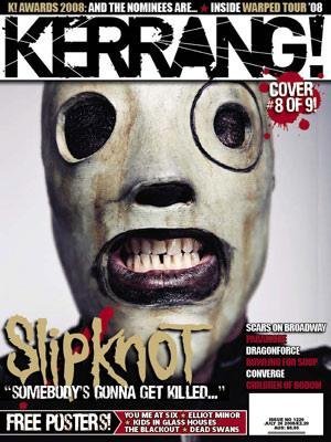
KERRANG! is probally the furthest you can get to NME, it's heavy, loud and got a lot of attitude. Whereas NME would try and be fairly polite to the readers, KERRANG! doesn't seem to give two. Altough it does seem to have come simaralities to NME, it's not mainstream. In fact very much the opposite. KERRANG! was launched 6th June 1981, a time when metal/ rock was very popular, where Slayer were brand new. If KERRANG! was launched now-a-days it would not catch on but I think it's the orgionality of it that keeps it at the top of the charts, in the field of rock magazines.
The word KERRANG! is onomatopoeic and is the sound made when playing a power chord on guitar, and because of the boldness of it, it is very attractive to teenagers who are into that scene.
In conclusion, these two magazines are very differant but in some ways very similar. They both aim towards the same age groups and are both going against the grain of society.
Thursday, 5 November 2009
The Brief
Main Task-
The front page, contents and doublepage spread of a new music magazine. All images and text must be origional, produced by you-minimum of four images.
Presentation Of Your Work-
The presentation of the research, planning and evaluation may take the form of any one, or a combination of two or more, of the following:
-a presentation usingsideshow software such as powerpoint
-a blog
-a podcast
-a presentation usingsideshow software such as powerpoint
-a blog
-a podcast
Thursday, 22 October 2009
Evaluation Of My College Magazine
In this task we were told we had to make a front cover for a college magazine and a draft for a contents page. I really underestimated this task as it proved to be a lot harder than I thought it would be. For starters getting a photo that would be eye-catching and relevant was very difficult. What to put on the front page for headlines, sub-stories, and general information was hard as well and I put a lot of research into getting the right things to put on the front cover. The contents page did not take as long as I thought it would; this was due to not having to put much on.
The first thing I did for my front cover was take a photograph. I originally took about fifty of around the college and the people in it. I then went back and started narrowing it down to about ten. Out of the ten I decided which one would be best to put on the front cover, this ended up been a photo of the Wilson Building. After putting it onto Microsoft Publisher I started work on the actual front cover. I needed a logo and slogan. I came up with “Wyke Weekly”, “College News” and Wyke News”. Wyke Weekly seemed too cheesy and it didn’t feel right having it on there. College News was too general and I wanted a magazine for this particular college. Wyke News worked well enough. As I sat back and looked at the front cover so far I realised I really didn’t like it. It looked too much like a brochure for advertising the sale of a house, or a leaflet advertising a university, not a magazine for 16-19 yr old students.
I scrapped the whole thing and started fresh. This meant re-taking all of the photo’s which set me back a little bit. I rang my mate and asked if he would be willing to pose for a few photo’s which at first he didn’t like the idea of. After convincing him he said he was with someone else who would be willing to do it as well. So I met up with them and walked around college taking photos with them in it. I went into the rose garden, into all the buildings and even around the building site. This time I came out with about sixty photos and again went through the process of narrowing them down to about ten. The one I found that was the most eye-catching and with the most potential was one of them in front of the main entrance. It was also one of the few where they weren’t blinking, laughing, coughing or sneezing.
I put this on Microsoft Publisher and came up with a new name for it; WykeMagazine. I incorporated this into the photo using the logo on the front of the main entrance. Also on the entrance sign I put the date and price. In the bottom left I put a barcode. I then edited the people in the photo and make them cartoon-like. I added the main headline; Halloween Party At Asylum. This is accompanied with facts about the party making you want to read on. I then took a photo of someone in my class and edited them to look like the devil and put that within the text. This was a task on it’s own as I had a great deal of difficulty getting the photo onto Microsoft Publisher without it having a white background to it. I then put a section in the top-left saying what’s inside. For the contents page I put the heading “What’s Inside…” with a list of contents and a photo.
In conclusion, I found this a fairly hard task and making the mistake of getting the wrong photo’s cost me a lot of time and effort. Overall I enjoyed making this magazine front cover and contents page and think that it has worked out pretty well.
The Creation Of A College Magazine
 My Stages Of Creating A College Magazine Front Cover
First off I wanted a cover that would catch your attention and look quite cool. Something a student would pick up, not a teacher. I took several pictures around college of people and buildings as a potential front cover. I ended up with about fifty photo's of Wyke College. To the left is a photo of the Wilson Building. This was the first front cover idea I had.
I wanted a quick, easy name to remember; WykeMagazine seemed appropriate enough. It wasn't trying too hard and by reading it you could tell what college it's for and that it is informal. This was then put in the font and colour of Wyke’s logo, bluey purple in bold writing. I then realised that this front cover was not catchy enough. It seemed too plain. Too boring. Not enough happening. The picture didn’t grab my attention at all and it looked more like a brochure advertising a building than a magazine for students.
I scrapped that idea and went for something new. I got my mate and his friend and asked if I take photo's of them. After a lot of work they said yes. I got them to stand

infront of different buildings and look happy. This was harder than I thought it would be. It was quite hard to get a photo of them
when they weren't laughing or blinking. In the end I got a photo of them infront of Wyke's main enterance. I took it into photoshop and edited it. I removed the word college on the sign, edited the logo Wyke to be 3D and shine and edited the two people to be cartoony and two tone. This (left) gave me a good magazine cover. I added the word "Magazine" under the Wykelogo and the price, date and slogan; "Everything You Need To Know". I then came up with a headline; "Halloween Party". This was accompnied with facts about the party and a photo I took of someone else in my media class edited to look like the devil. In the bottom right is a barcode. In the top left I put a section for "What's Inside". This explained what else might be in the magazine such as "Coursework Help" and "Smoking Rules Explained". The finished product looks like this:

infront of different buildings and look happy. This was harder than I thought it would be. It was quite hard to get a photo of them

when they weren't laughing or blinking. In the end I got a photo of them infront of Wyke's main enterance. I took it into photoshop and edited it. I removed the word college on the sign, edited the logo Wyke to be 3D and shine and edited the two people to be cartoony and two tone. This (left) gave me a good magazine cover. I added the word "Magazine" under the Wykelogo and the price, date and slogan; "Everything You Need To Know". I then came up with a headline; "Halloween Party". This was accompnied with facts about the party and a photo I took of someone else in my media class edited to look like the devil. In the bottom right is a barcode. In the top left I put a section for "What's Inside". This explained what else might be in the magazine such as "Coursework Help" and "Smoking Rules Explained". The finished product looks like this:

The Contents Page:
This is the contents page of my college magazine
Monday, 12 October 2009
Monday, 5 October 2009
Secondary Teachers (Contents Page)

The contents of Secondary Teachers is very simple, easy to read and packs a lot of infomation in without overwhelming you. There is a straight line down the middle with the page with the page numbers and to the right of that are what are on those pages.
There are pictures to show you what you might expect inside and a little welcome note with an e-mail address to the left of the page. The heading is "what's inside?" which is fairly straight forward and gives quite a casual look to the magazine.
At the very bottom of the page is the small print saying that the magazine is 100% recyclable which is good as now-a-days recyling is very important. It also says the terms and conditions the the compotitions that go on inside the magazine.
Thursday, 1 October 2009
Q Music Magazine (Review)

Q Music Magazine Review
"Q" is a major music magazine and is not the normal music magazine, most music magazines are just paper and are a price range of about 99p- £1.20. This is a glossy magazine with a price of £3.90. This is a music magazine for people who take a real seriousness of music.
The age group for this magazine is (instead of been for 16-21 like most music magazines) is for 25-40 years old. The logo is always in the top-left corner of the magazine with the catchline; "The UK's Biggest Music Magazine". There is normally a striking photo that will catch your attention. The photo will then link to the main story. In this case MUSE are releasing a new album and hoping for a new look. The photo is Matt Bellamy smashing a guitar.
There is then something in the bottom right that is the secondry main thing. In this case "200 Things You Didn't Know About The Beatles" accompnied with a photo.
The barcode is in the bottom left with the price and date.
Overall this magazine is an upper-class, fairly expensive magazine. But it does know what it's talking about, and is worth every penny.
Secondary Teachers (Front Cover)

The first thing you notice when you look at the magazine is the photo. This is made to attract your attention. It will then be a headline under or above the photo. In this case the photo is a child wearing boxing gloves. The headline is "Hooked".
In the top third of the cover is the title, Secondary Teachers. This is big and bold and makes sure you know the magazine.
At the very top of the magazine is a prieview of the magazine. For example, "Special end-of-year quiz".
At the bottom is the date and website.
At the bottom is the date and website.
Subscribe to:
Comments (Atom)

